National Art School
Identity, Guidelines, Web, Publishing, Digital, Campaign, Strategy
The National Art School has been teaching since 1843, and since 1922 inside the former Darlinghurst Gaol. Its graduates include Margaret Olley, Max Dupain, Wendy Sharpe and Ken Done. For more than a century, the school has held to a single idea: that artists are made through studio practice, working directly with their materials alongside practising artists, whether in life drawing, painting, sculpture or printmaking. As art education around the world has drifted towards the digital and the corporate, NAS has stayed with the studio.
The school came to us for a new visual identity, brand and voice guidelines, and a website. Our job was to give that idea a shape.
Approach
There was an easy version of this brief: help an old school look current, and say nothing in particular. We went the other way. The school’s insistence on making by hand, in the studio, over time, is not nostalgia. At a moment when images arrive on demand and institutions favour theory over practice, it is a provocation. Our job was to make that provocation legible.
We started by listening. Two days of workshops with teachers, students and management showed us what the school already had, and what mattered most to the people inside it. Rather than start from scratch, we built on that: elements in its existing language that carried meaning but had never been used. We treated the brand the way the school treats teaching, working with what was in front of us and making something of it. From there, three commitments held the work together. The artist comes first. The campus does some of the teaching. And human creativity is worth standing up for.
Result
The new identity backs what the school has always valued: rigour, studio culture and the slow, deliberate work of becoming an artist.
Now, NAS looks and sounds like itself, and like nothing else in art education. We rebuilt the website and aligned its expression across digital and print channels, all tied back to the school’s strategy, so the brand makes the case for studio practice wherever it appears.
The system is also built to move: it can turn up the creative volume for a graduate show or hold it back for a research publication without losing the thread. And it is built to be run, with guidelines that give the school a clear way to manage its own voice long after we have stepped away. It gives NAS a presence to match its teaching, plain about what it stands for, and not one word more.
History
What began as a prison now makes artists. Built by convicts in the 1820s, Darlinghurst Gaol housed prisoners until the early twentieth century before becoming an art school in 1922.
The National Art School has produced some of Australia’s most celebrated artists.
Design system
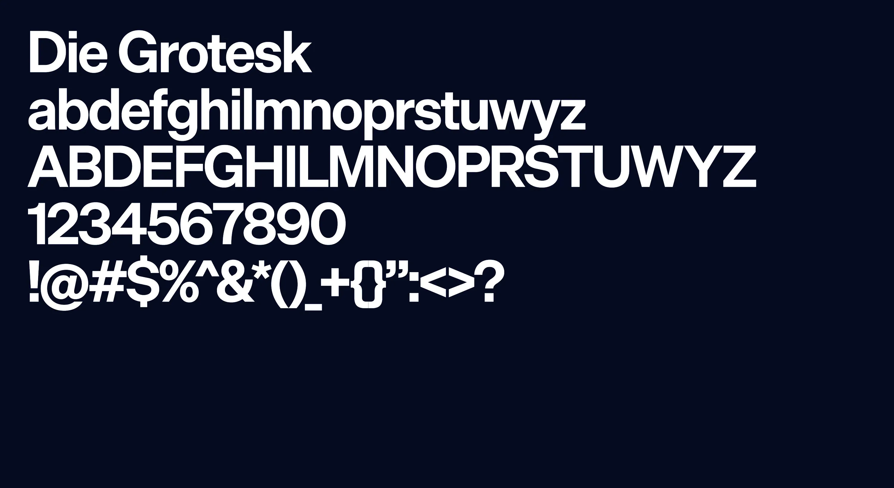
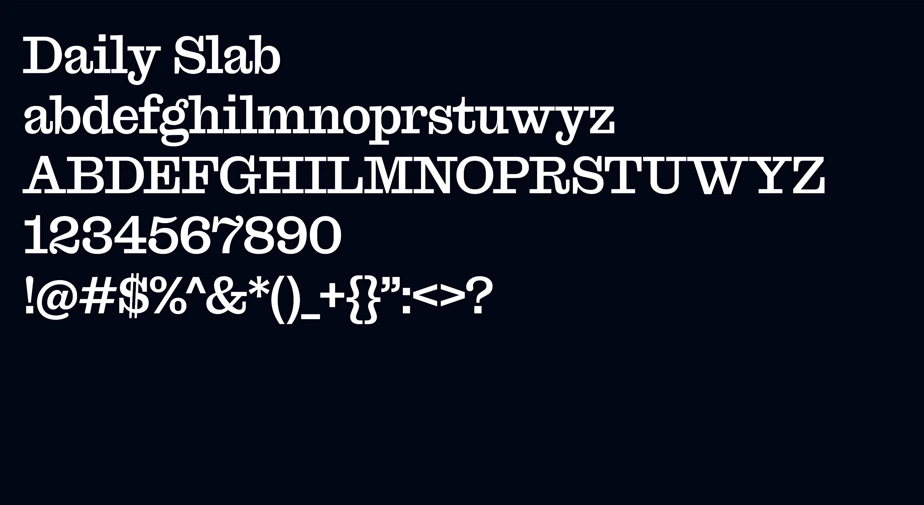
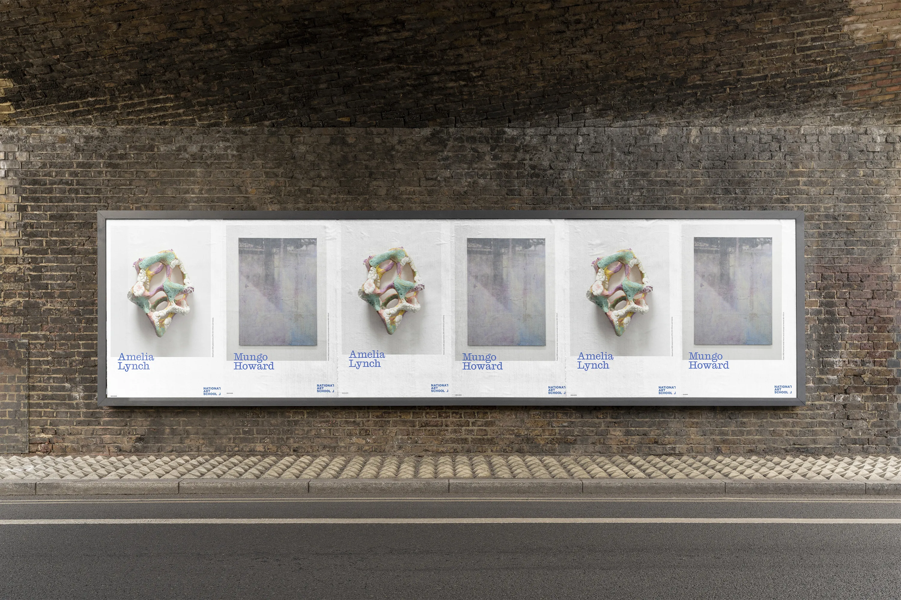
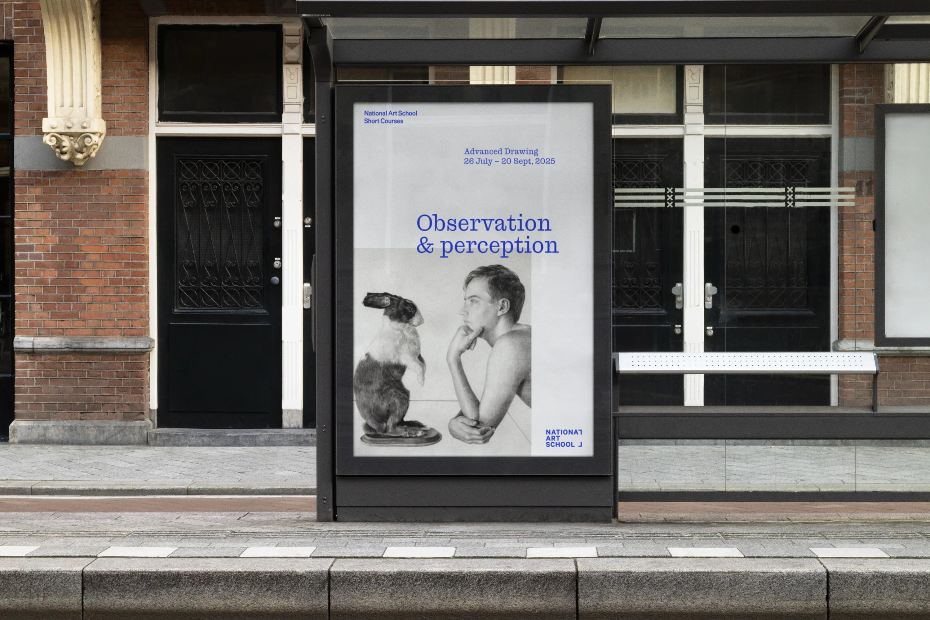
The brandmark redraws the school’s name in a heavier, more contemporary face, so it holds the page. In the old logo, we found an L‑shaped device that had never been put to work. We gave it a job: it frames the artist and their work, the way the school does.
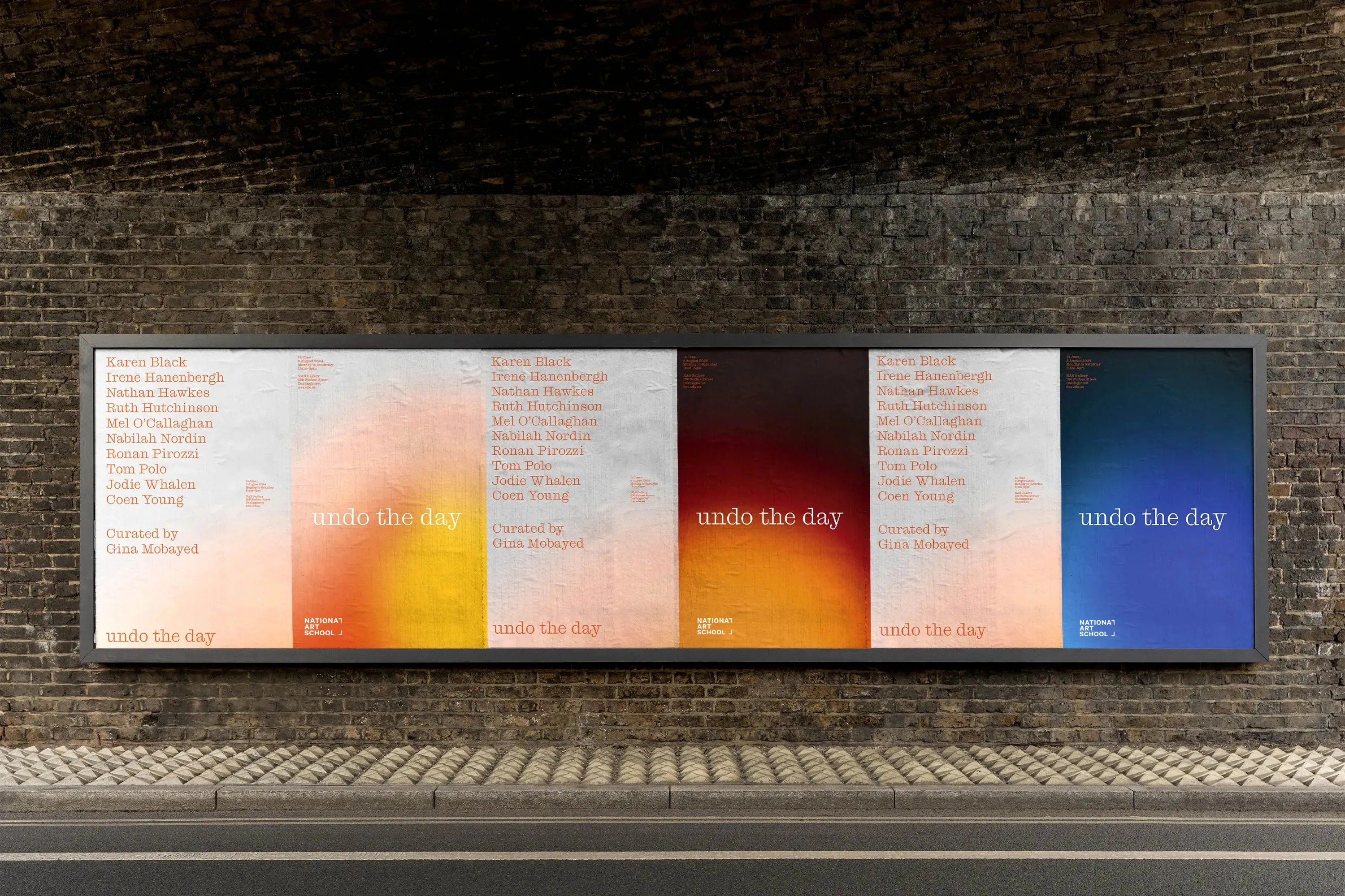
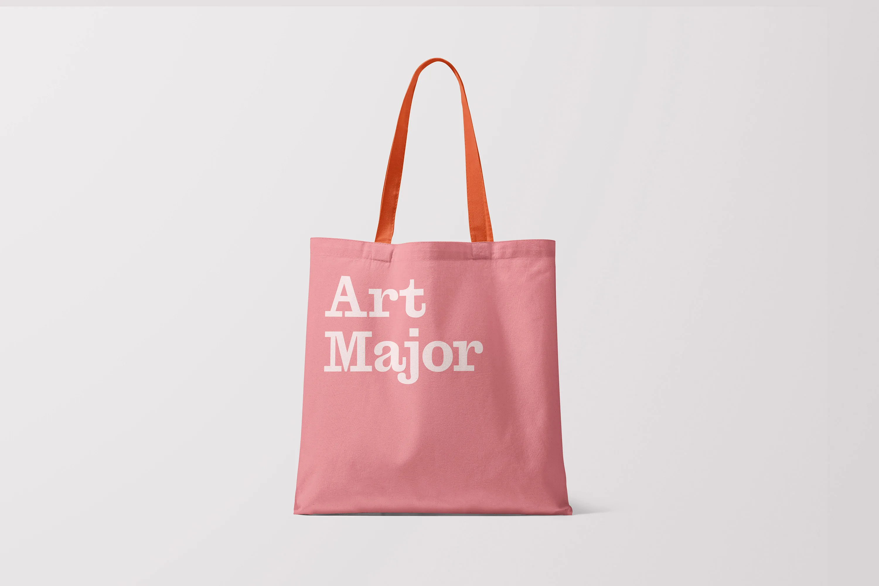
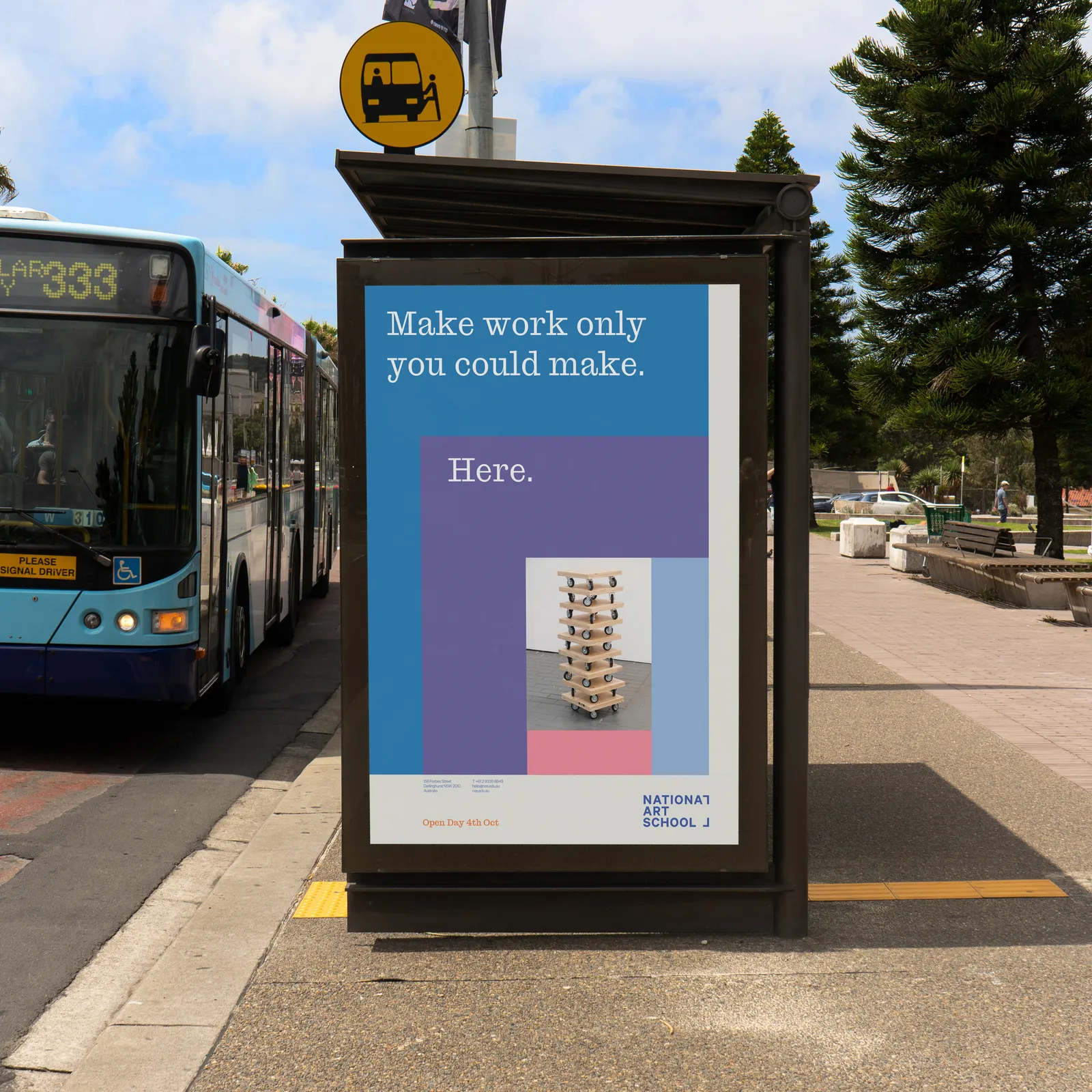
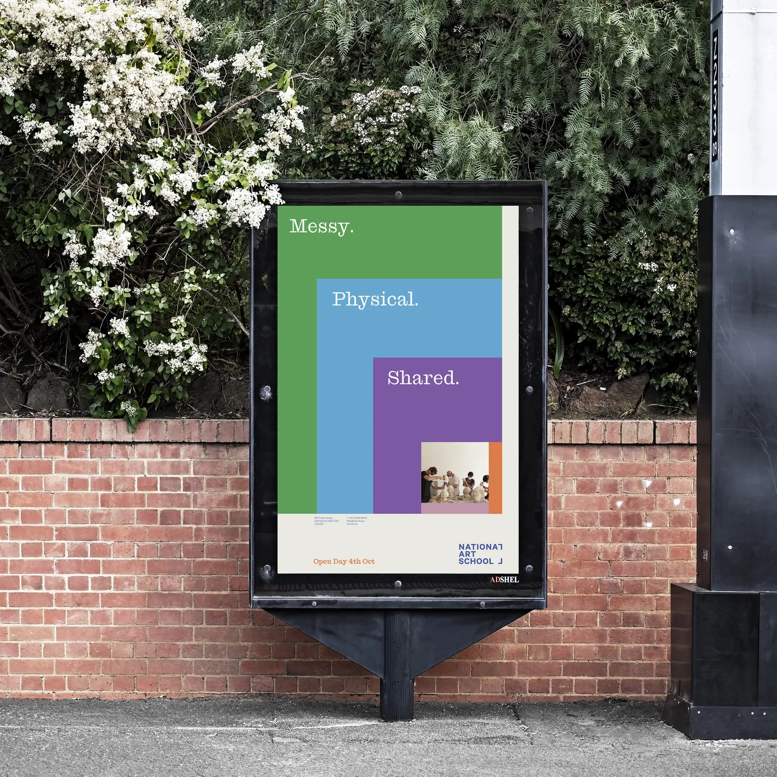
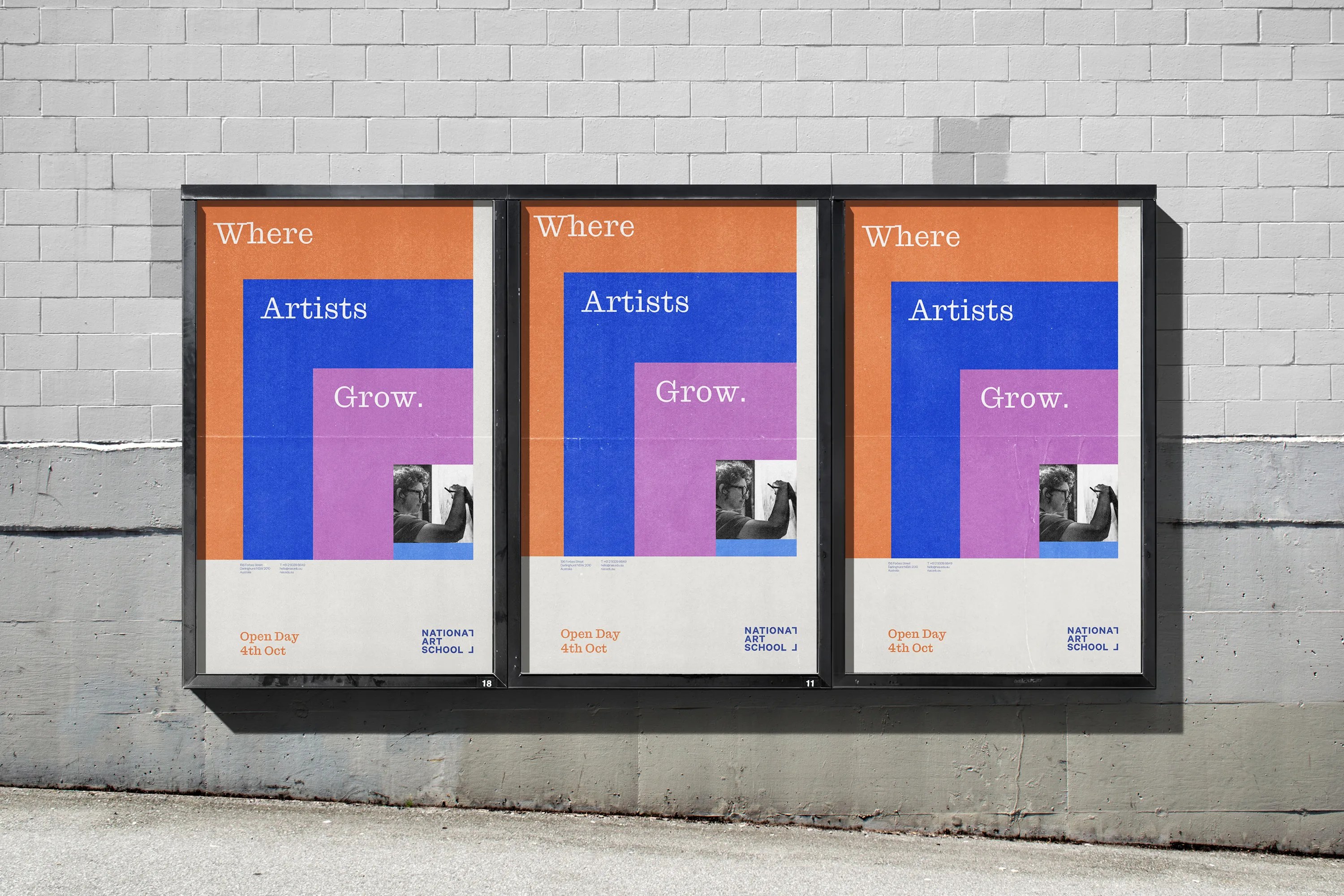
The colour palette comes straight from the campus and its history: the blue of earlier identities, the protest orange the school wore when it marched for its independence, the buff of Sydney sandstone, the lilac of the Darlinghurst jacarandas and the green of the lawns.
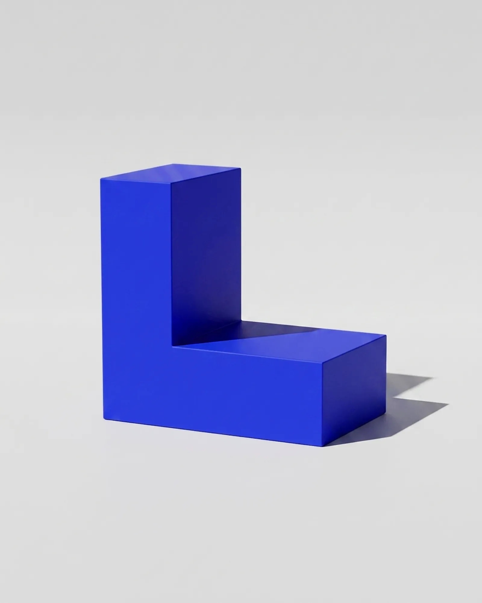
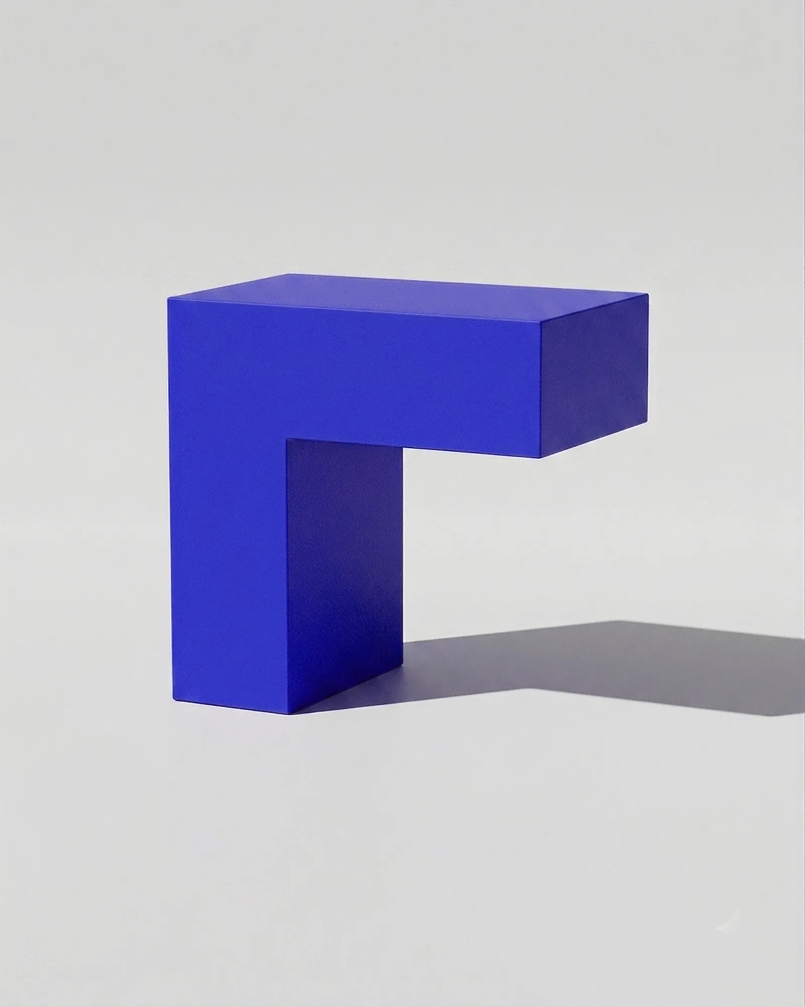
The L‑frame isn’t always explicit, but it runs through everything NAS does, a visual link that adds energy and dials up or down to suit the moment.
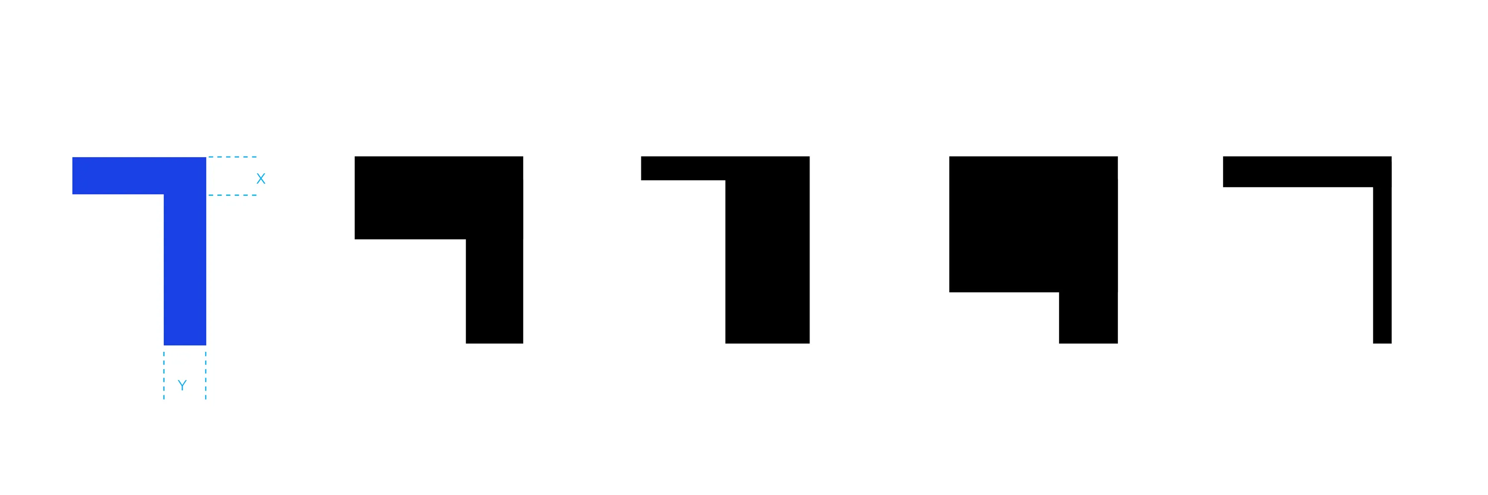
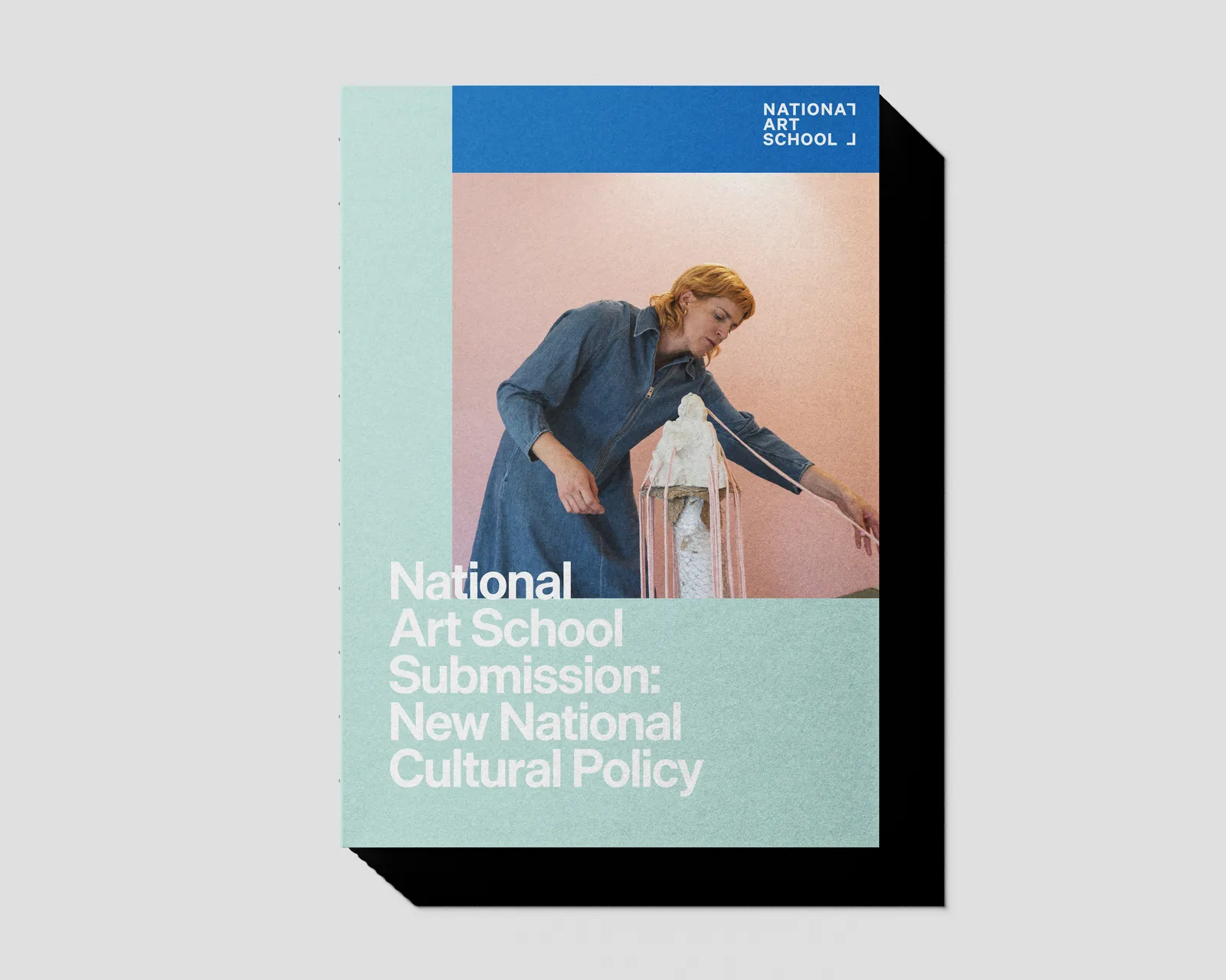
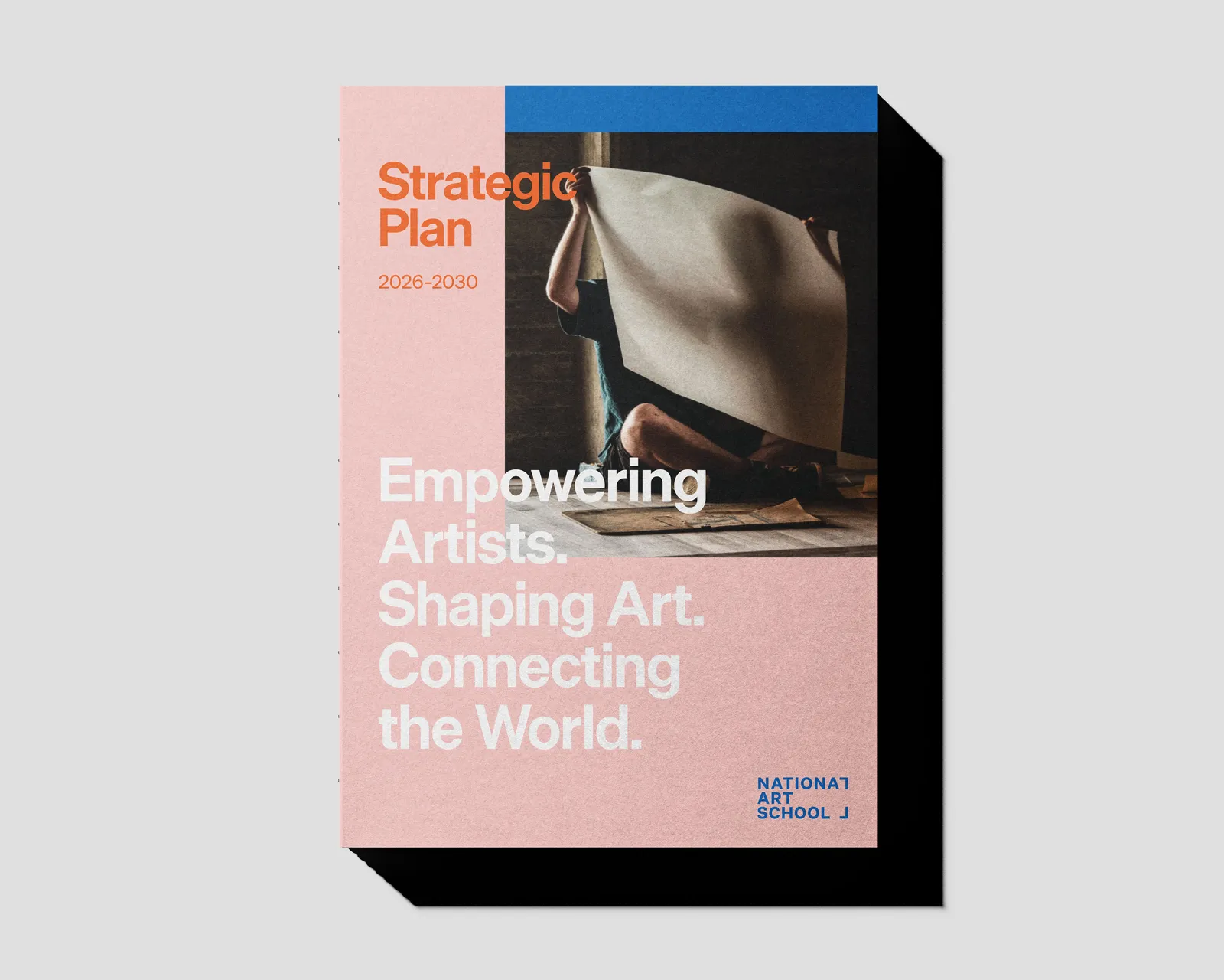
Asymmetric layouts, deliberate scale and open negative space give the identity energy and nerve.
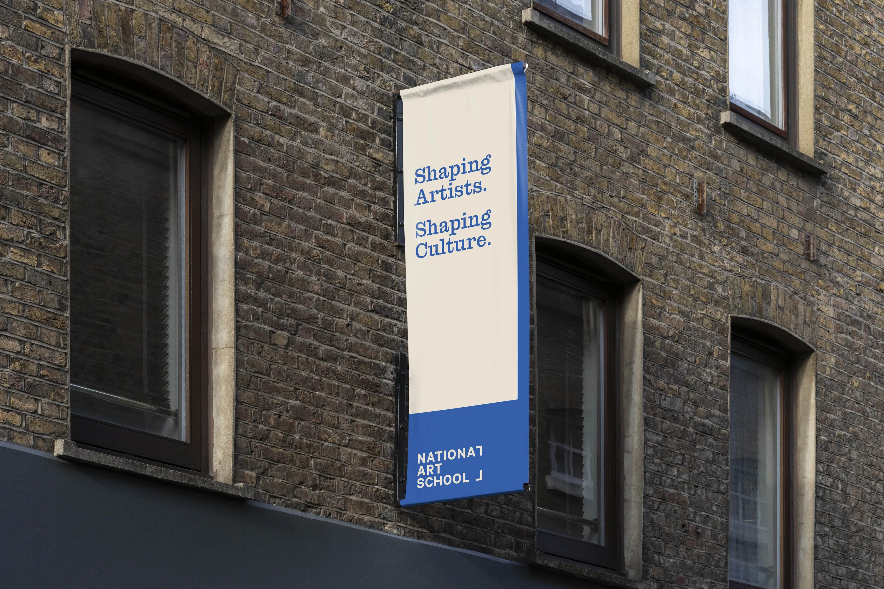
We gave NAS a voice of its own: attentive to place, written from the artist’s point of view, and unapologetic about why art matters. It sounds like the school rather than the sector, and gives it one consistent way to speak across everything it publishes, from a wall text to a prospectus.
Website
Visit the website
Social Media
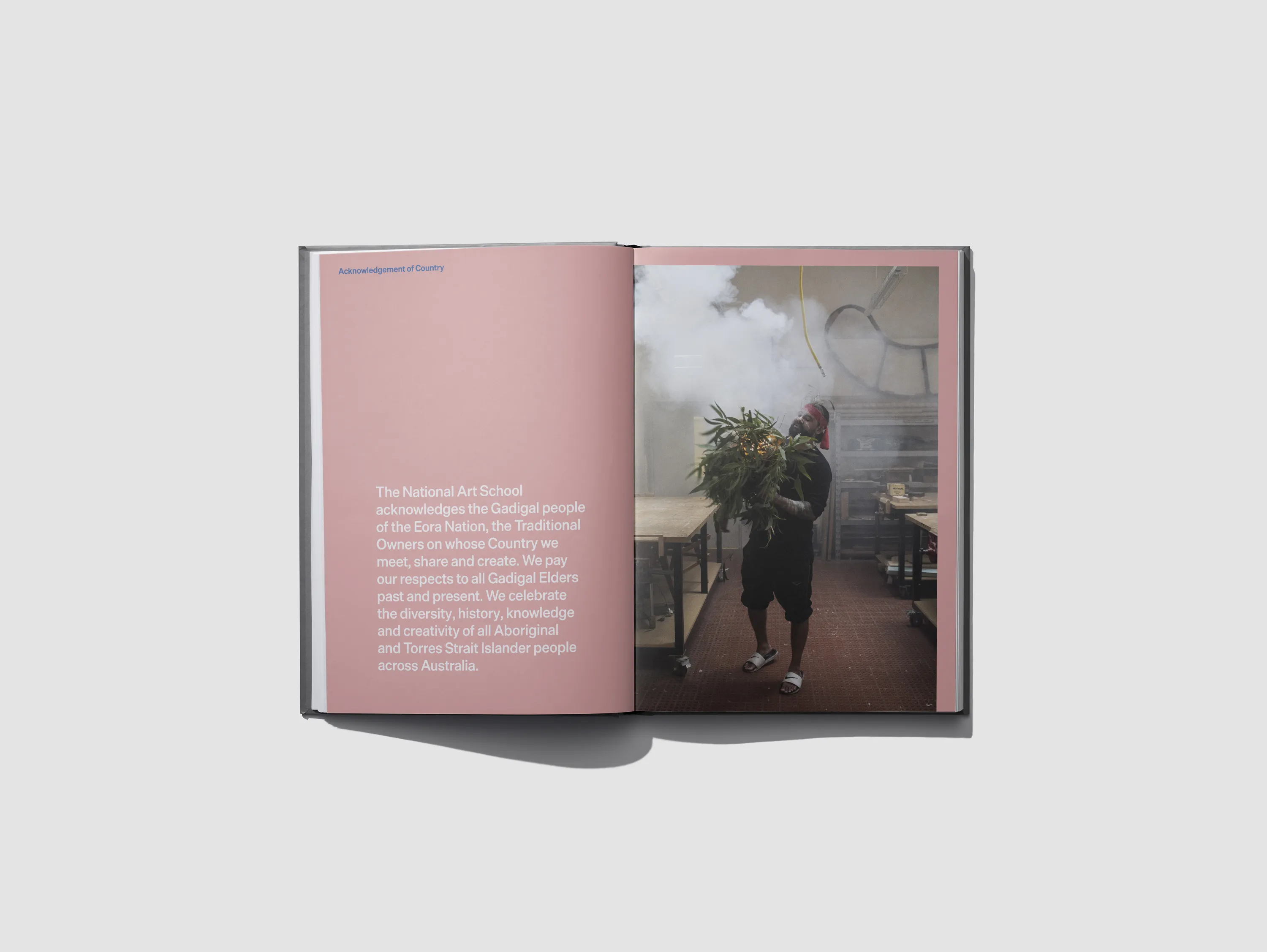
Across everything the school makes, the artist and their work sit at the centre, mirroring the school’s role.
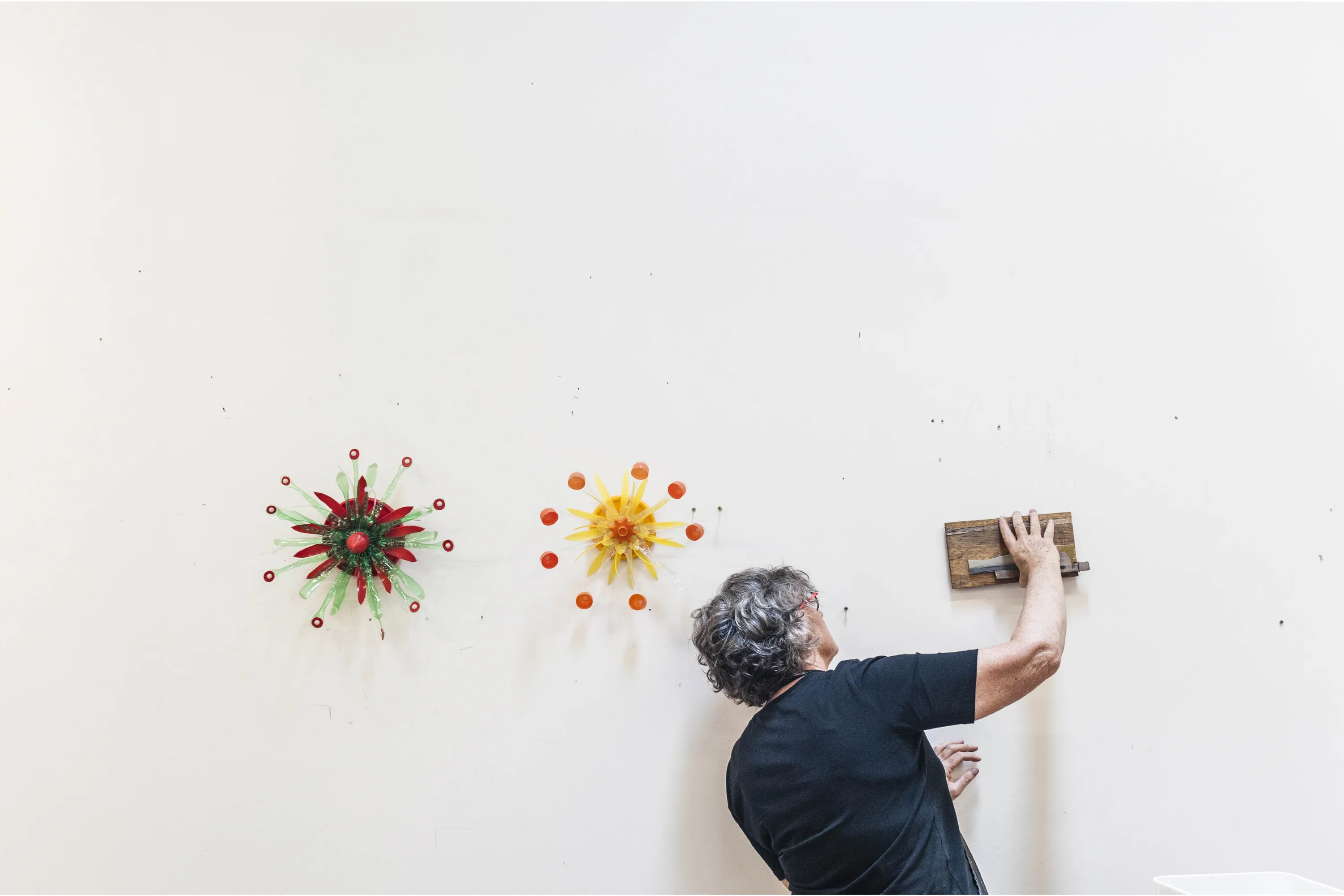
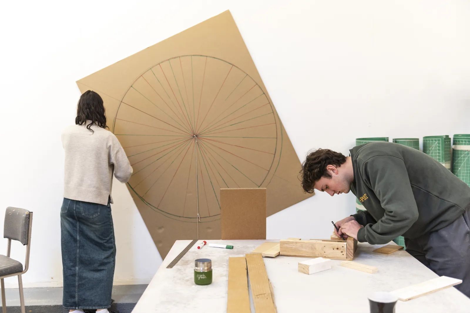
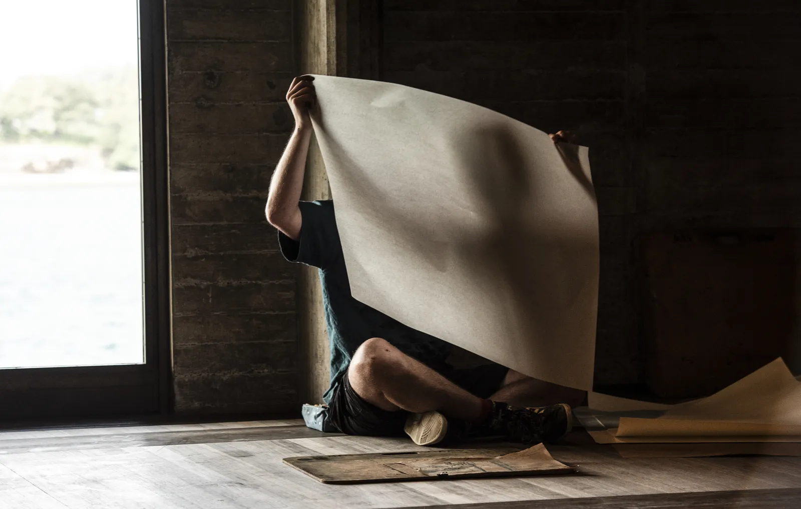
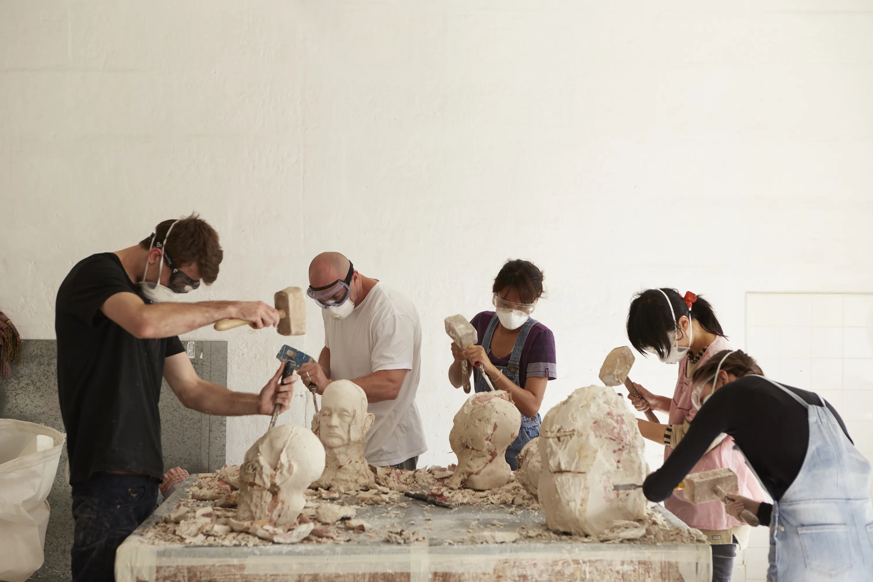
Students here learn the way artists always have: in the studio, by hand, over time. They draw from life, mix paint, carve, cast and print, taught by artists who still do the work themselves. It is slow, physical and demanding, and that is the point.
Sub-brands
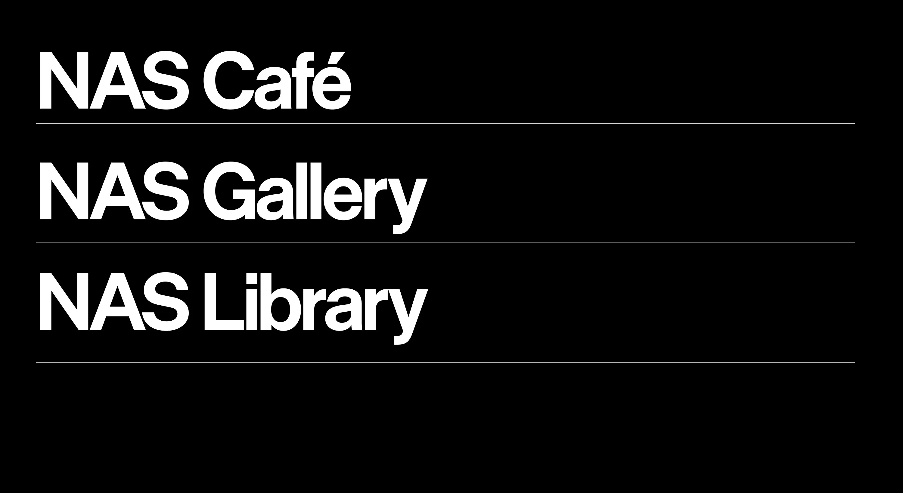
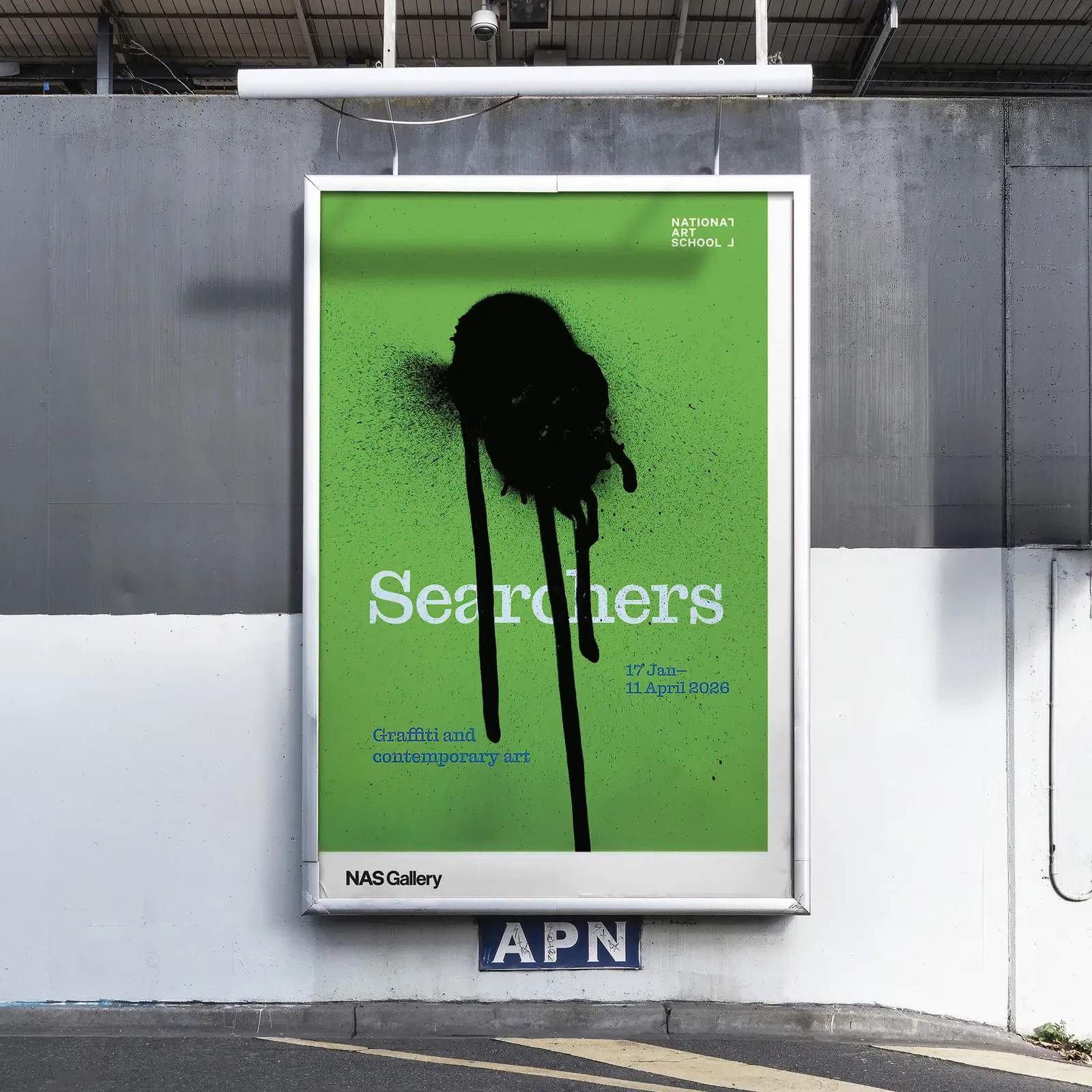
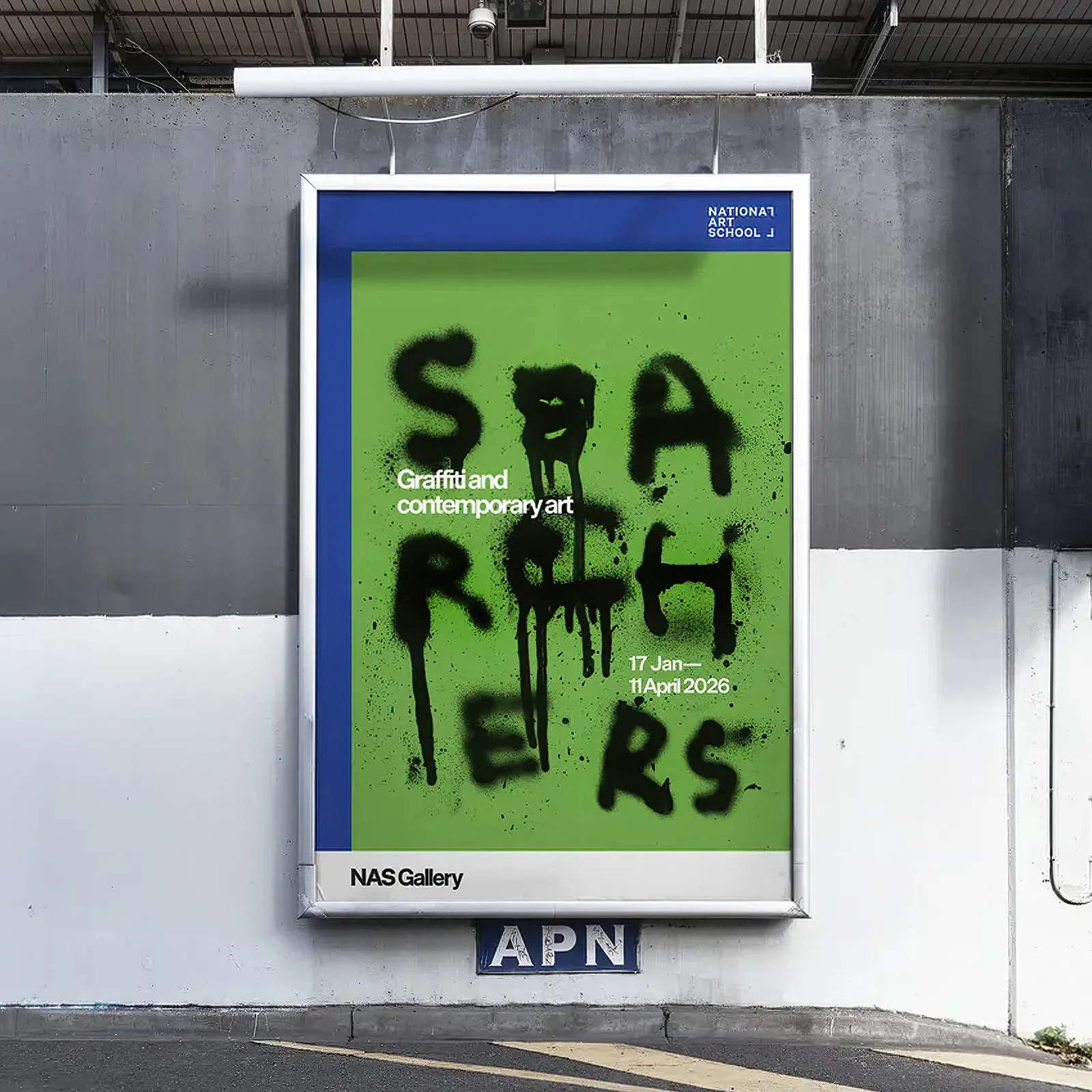
NAS Gallery
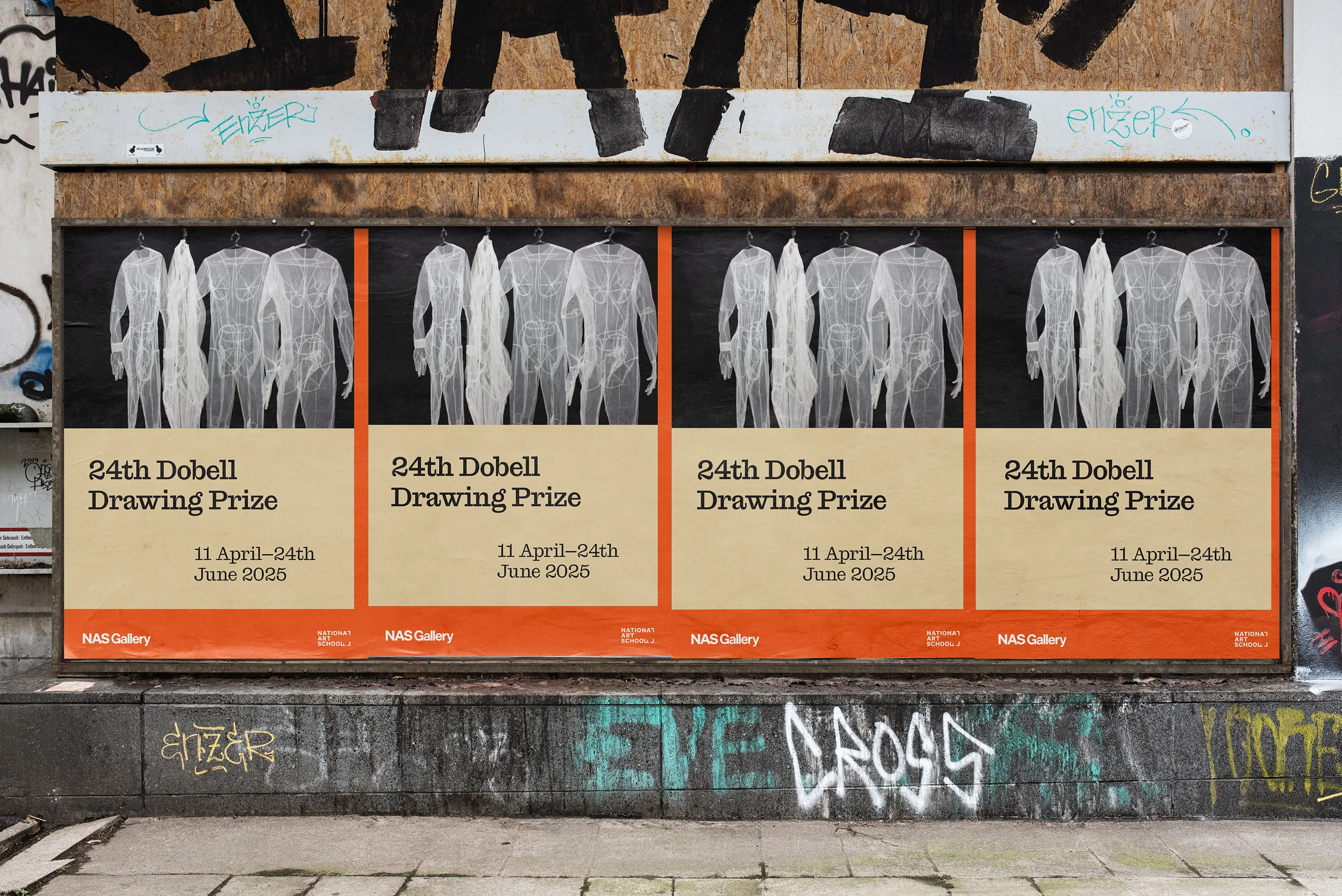
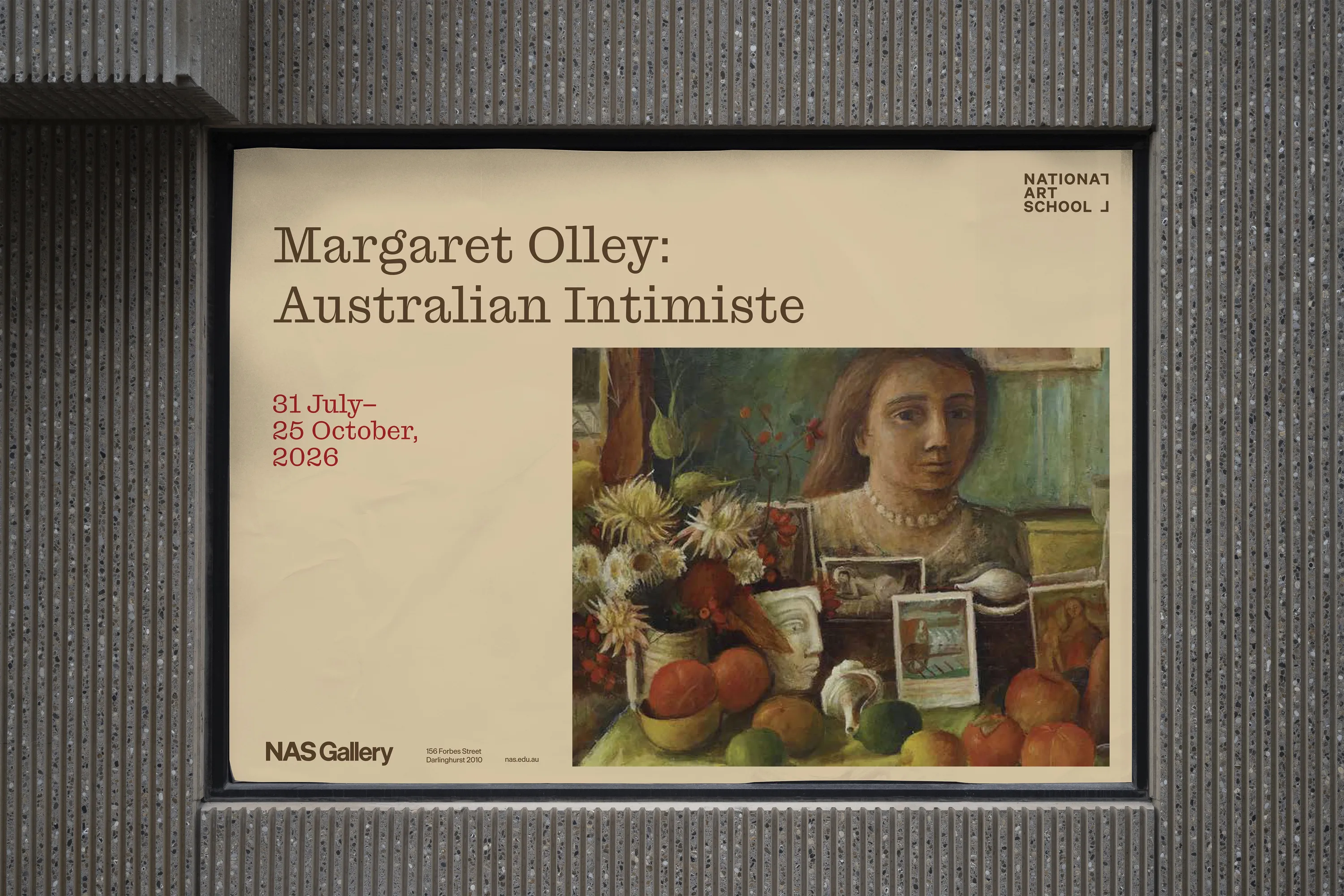
The NAS Gallery sub-brand is the system dialled right down, getting out of the way so nothing competes with the work on show.